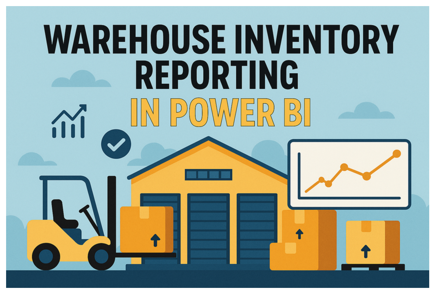
AI-Powered Warehouse Inventory Reporting in Power BI: A Beginner-Friendly DAX Guide
Blog post description.
HOW TOTECHNOLOGY
LogisticsFan
5/8/20252 min read
Let’s Make a Magic Warehouse List with Power BI!
A super-fun, easy guide—like counting blocks—with a bit of DAX magic at the end!
Why We Build a Warehouse List
Imagine you have a big toy box. You want to know what’s inside, right? A warehouse is like a giant toy box for a business. A Power BI report is our magic window. It shows:
What we have now
How many came in
How many went out
How long our stuff will last
What You Need
Power BI Desktop (free—ask an adult to help install!)
Your Data File (Excel or CSV) with columns:
Item (like “Red Car”)
Date (when it moved)
QtyIn (how many came in)
QtyOut (how many went out)
Step 1: Open Power BI
Click the Power BI icon.
Wait for the blank page.
Think of it as a fresh sheet of paper.
Step 2: Bring in Your Data
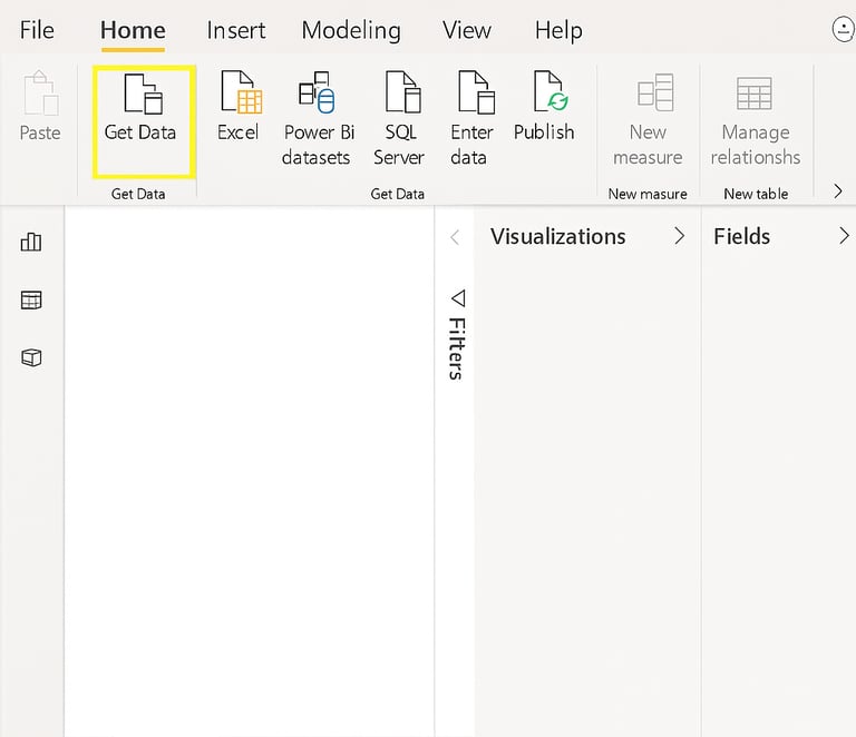
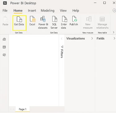
Click Get Data on the Home ribbon.
Choose Excel (or CSV).
Find and open your file.
Click Load.
Step 3: Peek at Your Table
In Fields, click your table name.
See columns: Item, Date, QtyIn, QtyOut.
If names feel wrong, click and rename them.
Step 4: Add a Calendar Helper (Advanced)
A calendar helps us slice by days, months, and years!
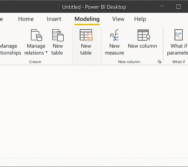
Click Modeling → New Table.
Paste this DAX and press Enter:
DAX
CopyEdit
Calendar = CALENDARAUTO()
Click the Model icon on the left to link tables.
Step 5: Teach Power BI to Count (DAX Measures)
We use DAX—Power BI’s math language—to count and compare.
Click Modeling → New Measure.
Type each measure and press Enter:
Total In (all that came in)
DAX
CopyEdit
Total In = SUM('YourTable'[QtyIn])
Total Out (all that went out)
DAX
CopyEdit
Total Out = SUM('YourTable'[QtyOut])
On Hand (what’s left)
DAX
CopyEdit
On Hand = [Total In] - [Total Out]
On Hand YTD (this year’s stock)
DAX
CopyEdit
On Hand YTD = TOTALYTD([On Hand], Calendar[Date])
Avg Daily Out (daily average out)
DAX
CopyEdit
Avg Daily Out = AVERAGEX(VALUES(Calendar[Date]), [Total Out])
Days of Supply (how long it lasts)
DAX
CopyEdit
Days of Supply = DIVIDE([On Hand], [Avg Daily Out], 0)
💡 Tip: Replace 'YourTable' with your real table name!
Step 6: Build Your Report
Click the Report icon (left).
Add these visuals:
Card for On Hand
Line Chart for On Hand YTD vs Calendar[Date]
Table listing Item, On Hand, Days of Supply
Slicer using Calendar[Date]
Click dates in the slicer to zoom in on any time period!
Step 7: Make It Shine
Click a visual.
Click the paint roller icon (Format).
Make text bigger.
Turn on data labels.
Pick simple, bright colors.
Add a title text box: “My Warehouse Magic List”.
Quick Tips for Young Report Builders
Save often with Ctrl + S—like saving your game!
Refresh data if your file changes.
Rename visuals to stay neat.
Explore other chart types for fun!
You Did It!
Look at your magic window—your warehouse inventory report! You can see what you have, how it flows, and how long it lasts. Share it with your team or family. You’re now a Power BI counting star! ⭐